Improving discoverability on our Telco SaaS platform via a navigation redesign

Wait. Who is Circles?
This helps:
-
Operators to quickly align with market app flows by enabling, disabling, or adding conditional logic to journey steps all within a code-free SaaS backend.
-
Manage their CRM, products, services, etc...
-
Tailor and personalise offerings or introduce new products for their customers.
-
Operators can manage regional settings based on compliance, telco regulations, and cultural nuances.
The Goal
-
Operators should be able to complete an entire customer onboarding or issue resolution process within one section.
-
Sections appear in groupings of frequently performed tasks.
-
Navigation should be dynamic based on a user's role.
My Role
I owned the UX strategy and design for this initiative end-to-end: operator portal audits, moderated card sorting across personas, the information architecture framework, and the final navigation design, reporting to our Telco Portal Head. Since the new architecture touched every market's operator experience, I also aligned the impact numbers directly with each market's portal and business heads before rollout, rather than treating this as a single-market ship.
Before

Three mechanisms, three different wins
We didn't ship one fix. We shipped three (role-based access, logical grouping, and search with keyboard shortcuts), and measured each on its own terms. That mattered, because they didn't help the same users in the same way.
01.
50%
faster task completion for admins
02.
40–60%
faster search/ keyboard shortcuts
03.
25–35%
reduction in cognitive load
04.
1.1–1.8 pts
CES improvement, platform-wide
The Problem
The Operator portal navigation faced 3 main issues:
-
Related workflows are scattered across different sections,
-
Every user sees the same overwhelming 17 menu items regardless of their role.
-
The current architecture requires costly customisation for each new market instead of being modular and configurable like LEGO blocks.
An Opportunity
How might we enhance the operator navigation experience to align with operator roles and mental models, ensuring faster access and logical grouping of sections?
First Step
I conducted a mind-mapping exercise of the current operator portal navigation to strategically identify relationships, gaps, and redundancies.

Next Step
I conducted moderated card-sorting exercises with key operator personas to generate data-driven insights into their mental models and most frequent tasks.





Card sorting exercises revealed our personas and key mental models. Keeping these in mind, I started looking at the navigation through the following lenses:
Task-flow lens:
Group by common user journeys such as customer onboarding, issue resolution, and billing cycles.
Frequency lens:
Most-used functions such as Orders, Customers, Products, etc... get prime real estate.
Dependency lens:
Related functions that users typically access together should be grouped.
Role-based lens:
Navigation views dynamically adapt to different user roles.
The new navigation is based on:
Core Principles:
-
Least Privilege: Users see only what they need for their role
-
Granularity: Control access at a fine-grained level (e.g., specific features, data, actions).
-
Simplicity: Streamline role and permission management so configuration is as simple and intuitive as possible.
-
Auditability: Track who changed what and when, for security and compliance.
-
Scalability: The system must handle growth in users, roles, and features without becoming unwieldy.
-
Market Adaptability: Design for a global baseline, permitting local overrides only when essential and protected by clear system guardrails.
Design Approach:
-
Tiered Role-based access (RBAC) with centralised management
Global/Platform Level Roles: Pre-defined roles with common permissions (E.g.; Admin/ Super Admin, Marketing Manager, PM, Operations, Customer Support, Shipping) -
Market-Specific Overrides/Additions: Controlled customisation at the market level.
-
Permission Sets: Grouping individual permissions into reusable sets.

Based on the new architecture, I mapped our existing navigation to the new navigation.

New role-based Navigation

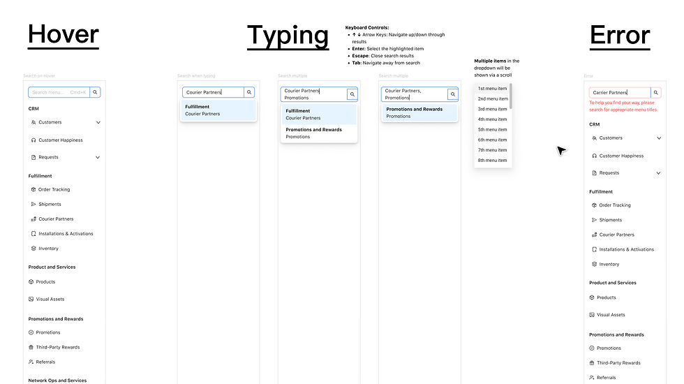
Navigation with search and keyboard shortcuts
Results
With the new navigation live since August 2025, here's what we've seen:
Role-based navigation
-
Reduced Cognitive Load (25–35%): Tailored role-based views removed irrelevant choices, eliminating decision paralysis and accelerating overall navigation by 20–30%.
Empowered Power Users: System admins (20% of the user base) benefited most, achieving a 50% faster task completion rate through targeted workflows.
Logical grouping
Workflow-Driven Navigation: Reorganised features around operational workflows rather than backend architecture, increasing discoverability by 30–40% and reducing misclicks by 15–25% by matching how operators actually think and work.
Search + keyboard shortcuts
Introducing search reduced find time by 40–60% for users who preferred direct input over browsing a 17-item list. Even occasional users saw an immediate 10% efficiency boost simply by having search available.
Who gained the most
-
New Users (+1.0–1.3 CES): Early gains were driven by role-based access and grouping removed upfront friction without requiring learning curves or shortcuts.
-
Admins & Super Admins (+1.5–2.0 CES): Heavy search users saw the highest overall impact as search performance and workflows improved.
Business impact
Beyond UX improvements, transitioning to a modular, role-based navigation architecture eliminated costly, per-market custom builds, cutting new market launch timelines from 6 weeks down to 4.
How We Measured Success:
Tracked task completion times, navigation depth, error rates, and CES scores pre- and post-launch, validated through a 2-week, 50/50 A/B test across a sample of 10+ users per role segment.